An Advanced Analytics Dashboard in 30 Minutes: The Practical Guide for Decision Makers
We all know this nightmare: you need answers from your data right here and now, but the BI department asks for two weeks just to define the requirements. In a technological reality where every minute counts, the ability to turn a raw CSV file or a cloud database into an interactive interface is no longer a privilege, it is a necessity.
With modern No-Code and Low-Code tools, you can skip the traditional development stages and build a professional dashboard that includes dynamic filters, advanced charts, and even an artificial intelligence (AI) layer that analyzes the data for you, all in half an hour of focused work.
Choosing the Foundation: Streamlit or Retool?
Before diving into code or the interface, you need to choose the right tool for the job. Today there are two main players that shorten the way:
- •Streamlit: If you are comfortable with a few basic lines of Python, this is the tool for you. It turns data scripts into interactive apps in seconds. It is perfect for data scientists and developers who want maximum flexibility.
- •Retool: The ultimate solution for anyone looking for No-Code. It lets you connect databases (SQL, MongoDB) and APIs by dragging and dropping (Drag-and-Drop) ready-made components.
In this guide we will focus on the fast Low-Code approach, which combines flexibility with top speed.
Step 1: Connect the Data (5 Minutes)
Every dashboard starts with information. Instead of getting tangled in server settings, use the Pandas library (if you are in Streamlit) or Retool's direct connection to Google Sheets or PostgreSQL.
Pro tip: make sure your data is "clean" before loading it. If it is a local file, make sure the date format is consistent and that there are no missing values that could break the charts later. If you work with BigQuery, use preliminary queries to pull only the relevant data.
Step 2: Build the Interface and the Visualization (10 Minutes)
A good dashboard follows the "3-second rule": the user should understand the business situation within 3 seconds of opening the screen.
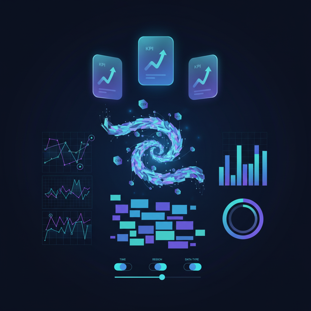
- •KPI Cards: Place the critical metrics (revenue, conversion rate, number of users) at the top.
- •Dynamic charts: Use libraries like Plotly to create charts that let the user hover (Hover) and see exact values. A line chart is perfect for trends over time, while a bar chart suits comparisons between categories.
Step 3: Filters and Interactivity (10 Minutes)
This is where the dashboard becomes a real work tool. Add a sidebar (Sidebar) that includes:
- •Date range picker: Lets you compare between quarters or months.
- •Category filter: View the data by geographic region, product type, or sales team.
In Streamlit, this looks as simple as one line:
st.sidebar.multiselect('Choose Region', df['region'].unique())Step 4: The Advanced Layer, AI and Export (5 Minutes)
To make the dashboard "smart," you can today integrate AI engines like the OpenAI or Claude API. Add a text box that lets the user ask questions in free language (Natural Language Query) such as: "Who was the most profitable customer in August?", and the AI will return an answer based on the displayed data.
Finally, do not forget the export button. Managers still like to take their data to Excel or PDF for presentations. Adding a
Download CSVSummary and Conclusions
Building an advanced dashboard is no longer a project of months. The key is not to try to build the perfect system on day one, but to use a Low-Code tool to release a first version (MVP) within 30 minutes, get feedback from the field, and improve it gradually.
The real value is not in the stunning graphics, but in your ability to take raw data and turn it into fast business insight that leads to action.
Want to go deeper? Here are excellent resources to start with: